
Schematic changelog
Drop-in Components and Build Your Own UI
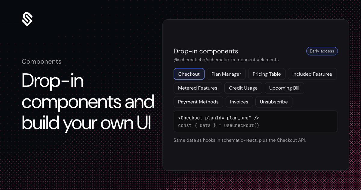
Some billing screens are fine off the shelf, and others have to match your product exactly. Components now has two ways to build them on one data layer, and you can mix them, say a custom portal with a drop-in checkout.
Drop-in components come from @schematichq/schematic-components/elements. Import one, pass props and theme it with CSS variables; light and dark follow the page's color-scheme. There are ten: Checkout, Plan Manager, Pricing Table, Included Features, Metered Features, Credit Usage, Upcoming Bill, Payment Methods, Invoices and Unsubscribe Button.
To build your own UI, @schematichq/schematic-react has one hook per billing resource, each returning data, error, isPending and refetch, plus derivation functions and Intl formatting helpers. The Checkout API treats a checkout as a persisted cart the server prices on every write and charges once.
To set up, install both packages, mint a short-lived temporary access token for the company on your server and wrap your app in the provider. Or tell your coding agent: "Add Schematic billing to my app: docs.schematichq.com/components/skill.md".
Portals built in the component builder keep working, and the migration guide moves them one card at a time.
Docs: Components overview and Build your own UI
Early access. Ask us and we'll turn it on for your account.